(Case study · 06)
Plinth
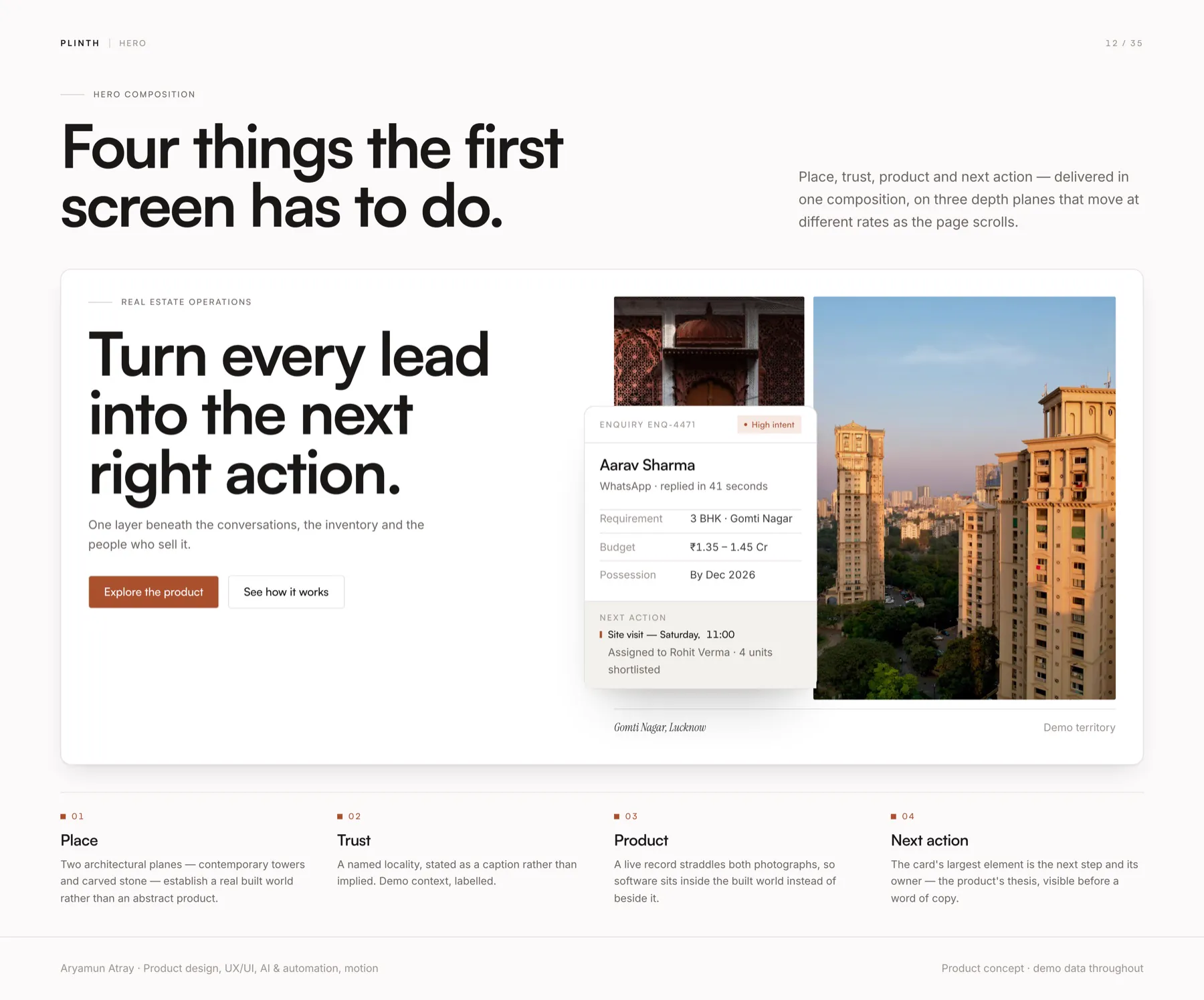
Plinth is the built base a structure stands on, and ordinary vocabulary on an Indian site. The product is positioned the same way — the layer beneath a sales organisation rather than another dashboard on top of it.
A self-initiated case study. The product and every record in it are demo data — no real customer, development or business result is described.
(Why I made this)
What if a CRM did the feeding instead of asking for it?
A property sales floor leaks leads between enquiry and booking. Enquiries arrive in many places, requirements get retyped, and follow-ups live in someone's memory.
The usual answer is a CRM, which is a filing cabinet you have to feed.
I wanted to design the layer beneath a sales team: one that does the feeding, and hands each salesperson the next right action while leaving the judgement to people.
(What I looked at)
What I wanted to understand
This is a self-initiated case study, so there's no client research to show. These are the questions I worked from, and the case study's own rules.
- How a sales floor works
- Enquiry, requirement, shortlist, site visit, follow-up: the steps the product would have to carry.
- Where judgement belongs
- What can a system do on its own, and what must a person decide?
- Accessibility
- WCAG 2.2 AA, and the whole site readable with scripts switched off.
(What changed because of it)
Question, decision, screen
Design decisions · each is visible in the build
A CRM is a filing cabinet you have to feed.
Tell the story first: nine chapters, with the software shown ninth.
The site's order
Salespeople need the next right action, not a list.
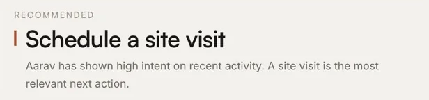
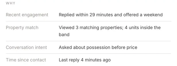
My Day opens on priority actions, each with a recommendation and its reasons.
My Day
Automation shouldn't make decisions for people.
Recommend, explain why, and send nothing until the salesperson acts.
"Nothing is sent until you act"
Pipelines are tables in real life.
The pipeline stays a table.
Pipeline
(Information architecture)
A workspace for one salesperson's day
The navigation follows the work: today first, then the people, the properties, the conversations and the visits, with automation and analytics last.
Plinth workspace
- Today
- My Day: priority actions, site visits, follow-ups
- People and property
- Leads
- Customers: Customer 360
- Properties: inventory and matching
- Conversations
- Follow-ups
- Site visits
- Behind the scenes
- Automation
- Analytics
- Team and settings
(Values)
What I refused to compromise
The judgement stays with people
Plinth recommends and explains; nothing is sent until you act.
Describe the output, not the technology
The intelligence is shown by what it produces, never by its buzzwords.
Native scroll, untouched
No smooth-scroll layer; the page never fights the visitor's input device.
One accent, under 5%
Warm paper, one clay accent, 1 px rules. Depth from surfaces and timing, not shadows.
(Mood board)
Warm paper, one clay accent
The ground is warm paper, never cool grey and never pure white. Clay is the only accent and stays under 5% of any screen. Radius varies by role, from 2 px on data pills to 22 px on the device frame.
Colours sampled from the product's screens
- Paper
#F3F1ED - Card
#FFFFFF - Ink
#1A1815 - Clay
#A8502C

- Quiet
- Exact
- Human judgement
- Paper, not glass
(What I made)
A product website and a 17-route web app
I made everything: the nine-chapter story site with a three-plane scroll-driven hero, and a 17-route web app built from the same token file and components.
- My Day
- Leads
- Customer 360
- Inventory and matching
- Conversations
- Follow-ups
- Site visits
- Automation
- Analytics
The screens
An operating layer for a property sales floor: enquiry, requirement, shortlist, site visit — the repetitive parts handled, the judgement left to people.
(Up close)
My Day
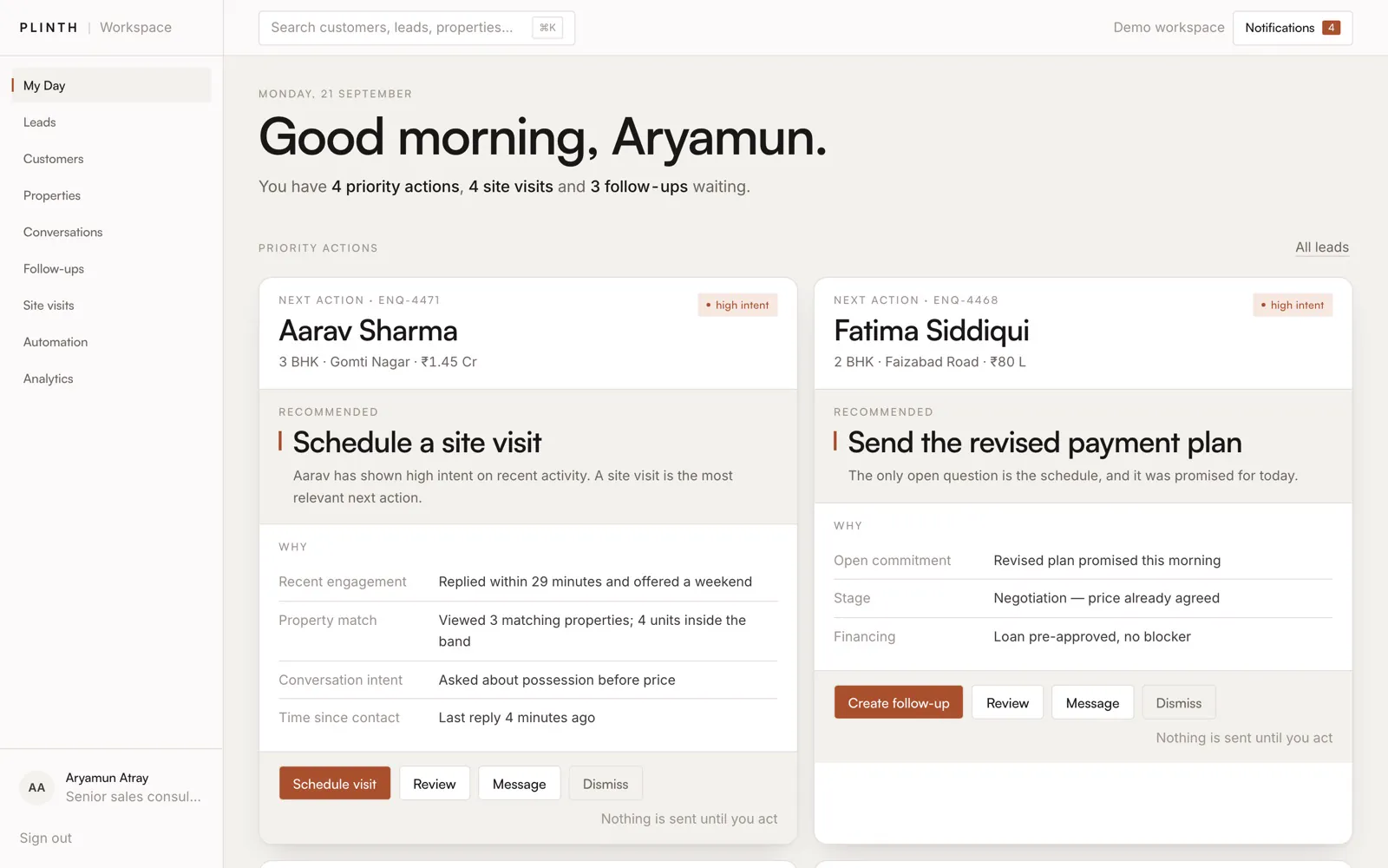 12345
- The day in one sentence: actions, visits and follow-ups waiting
- High intent, flagged on the card
- One recommended action per person
- Why, line by line: engagement, match, intent, time
- "Nothing is sent until you act"
(Quality)
Checked, not assumed
A UX audit came back with zero horizontal scroll, no target under 24 px and sequential headings. Every record in the product is demo data: no real customer, development or business result is described.
- Accessibility
- WCAG 2.2 AA; reads fully with scripts off
- Audit
- Zero horizontal scroll, no target under 24 px
- Data
- Entirely fictional
(What I learned)
Plinth taught me that the most persuasive product page shows the argument before the interface. By the time the software appears, the visitor already wants it.
Need something like Plinth?
Tell me what you want to build. I'll reply with how I'd build it, a rough timeline and a cost range. Free, and no obligation.
Next project
LUMA Business OS